Stonks Academy
Spring 2023
Project Overview
I was tasked with designing a mobile app for a class-long project during my master's program. We were given the freedom to choose the app we would create. I am interested in stock trading and have developed algorithms using data science techniques as a hobby. I thought it would be interesting to make an application allowing someone to build and test their own strategies, much like a data scientist would do.
My Role
I was the sole designer for this project and produced all deliverables from the project brief to the prototype.
Problem
I created a fictitious company named Stonks Academy that only produces educational content for beginner stock traders and investors. This company wanted to expand its product offering by building a trading simulator for students to practice what they were learning. There are already some established tools to test stock trading strategies in the industry, but only some are approachable to beginners. This project aimed to design an app that could help a beginner investor learn stock trading in a risk-free environment.

Process
Project Brief
The first thing I did was create a project brief that outlined the project's scope, what would be delivered at the end of the project, and other things related to the project plan.
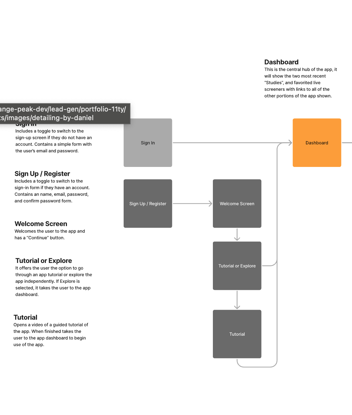
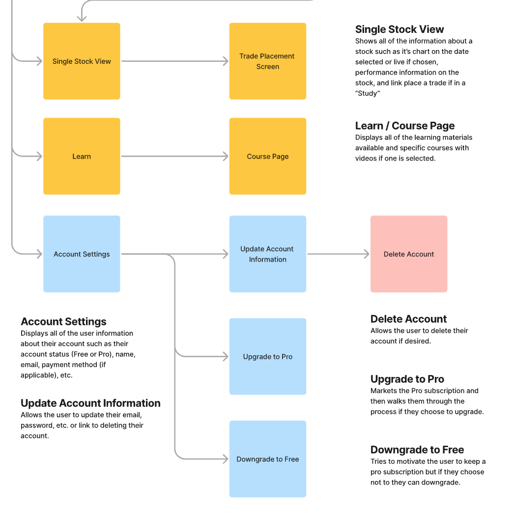
Site Map and User Flow
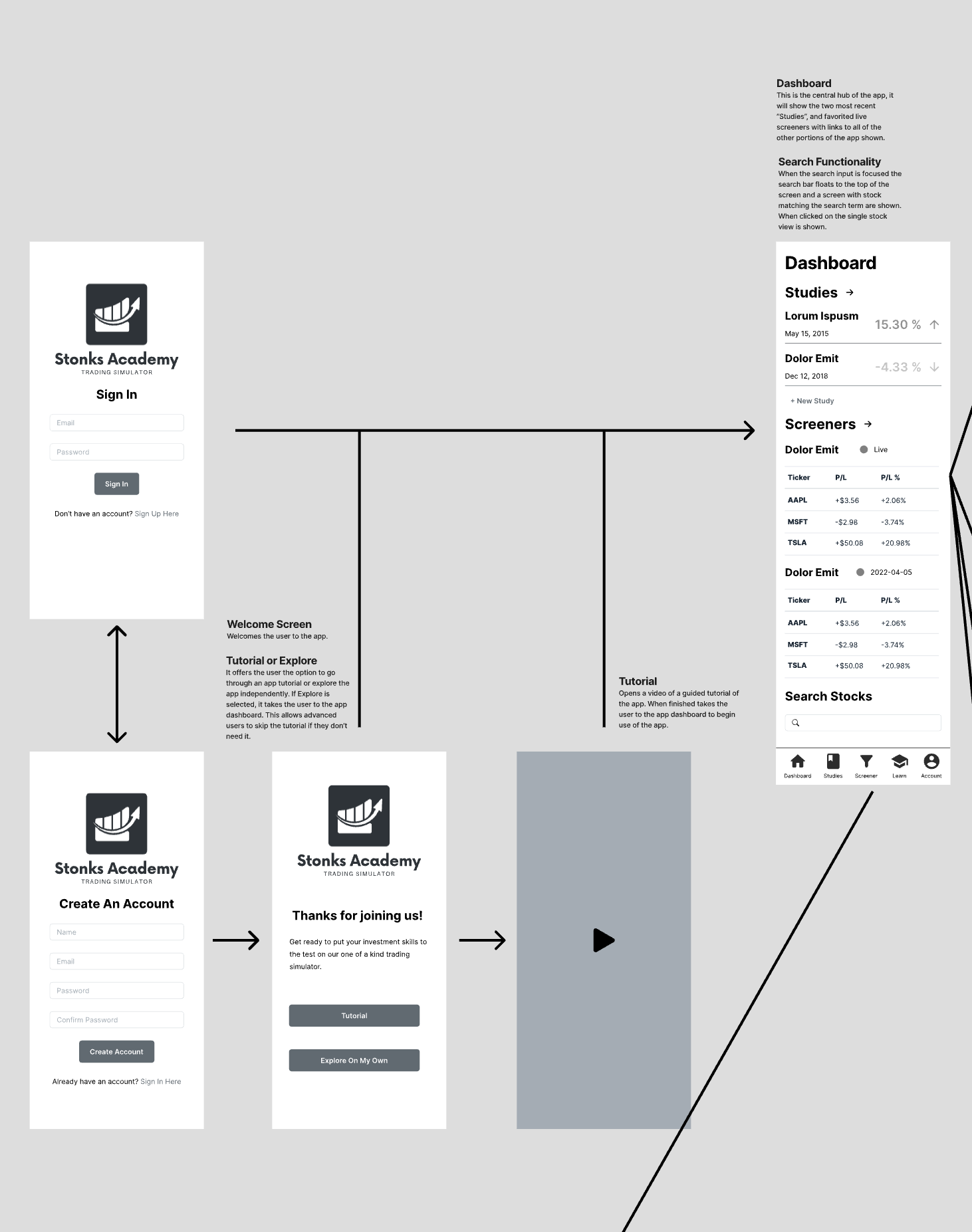
To outline the app, I created a site map that walked through each interface and the actions that would be completed. This gave me a high-level application overview before diving into the higher-fidelity wireframes. This phase of my process helped me organize my thoughts and visualize how the application would flow and feel.
Wireframes
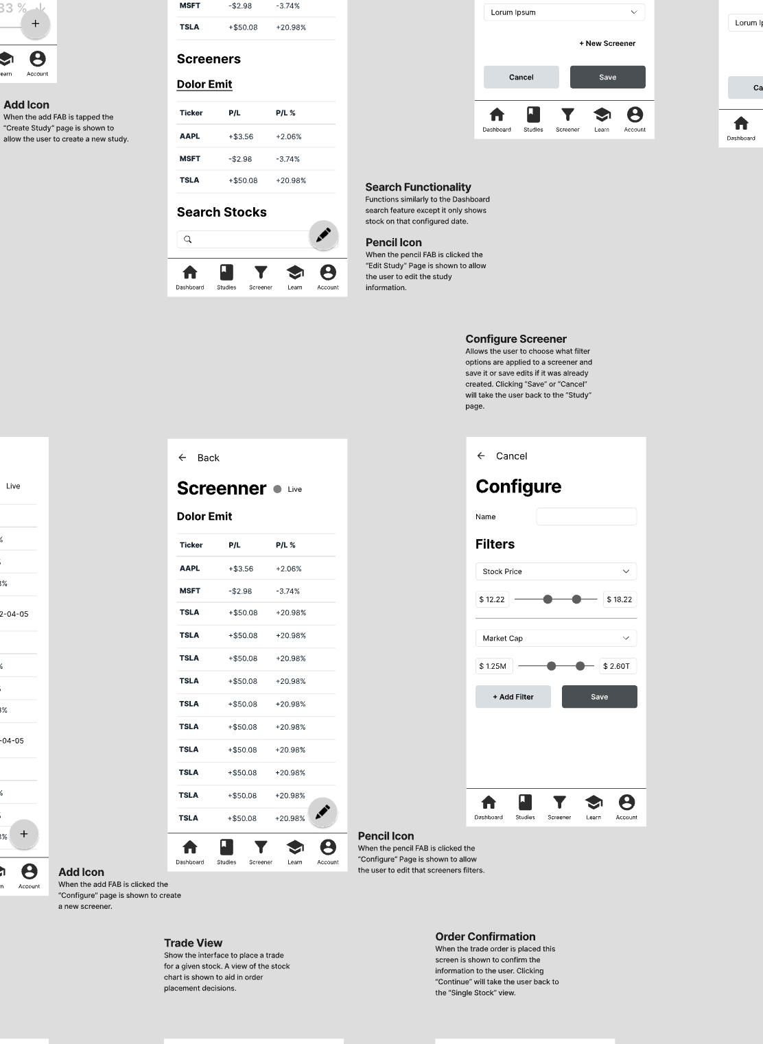
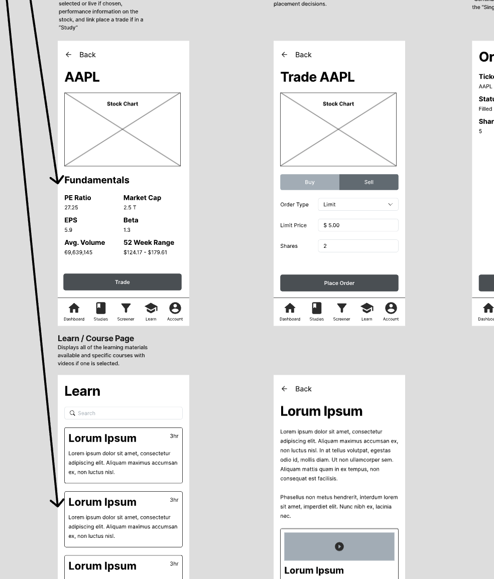
After getting feedback from my classmates, I proceeded to build the wireframes. I went through a couple of design iterations based on feedback from my instructor and classmates. The result included the interface for each screen of the app. They were produced in grayscale to focus more on the design's functionality and not get distracted by the color.
Prototype
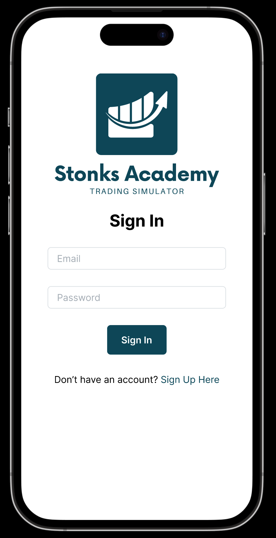
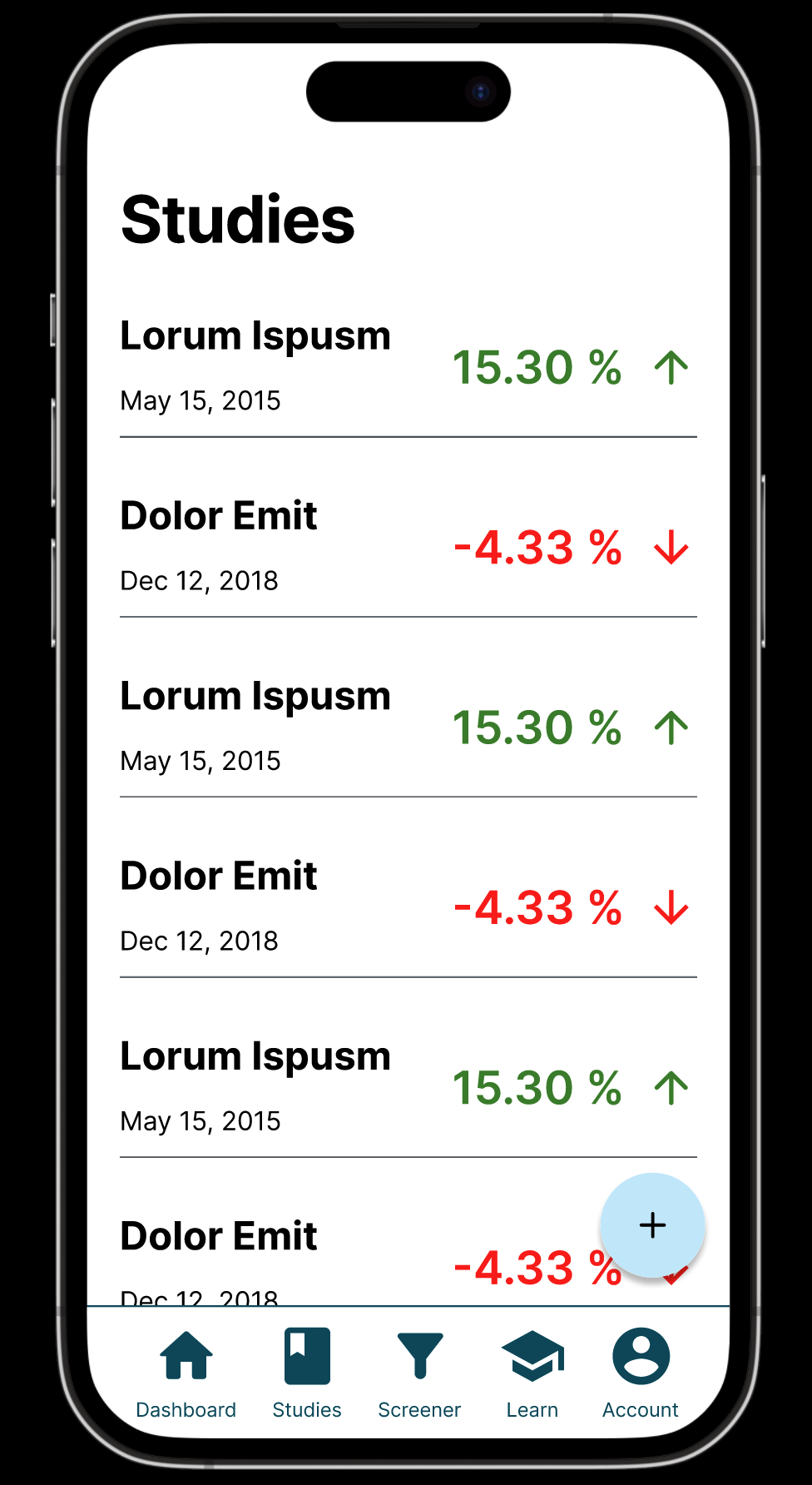
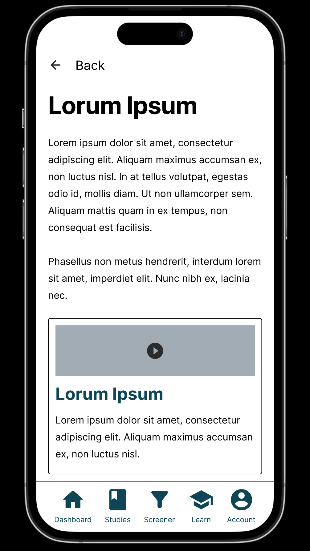
The final step of the app design was the prototyping phase. I incorporated color into my design and connected each interface to create a clickable prototype using Figma. These prototypes were ready to start usability tests. Efforts were made to create a realistic experience of how the app would behave if implemented in code, but there were limitations. If you want to view my prototype, it is linked in the "Results" section below.
Tools
-
Figma
Challenges
The Importance Of Iteration
Throughout this project, I learned how important it is to iterate on a design until it makes sense and feels right. Sometimes I have wondered how often we need to keep visiting an interface until we finalize it, and the answer I found is until it is the best solution. In other design projects that I had completed, I had never built a site map that builds out the main user flows of an app before going straight to wireframing. I found this step helpful, and it set the course for the whole project.
Receiving and Implementing Feedback
I really appreciated the feedback given to me by my peers and my instructor. Allowing someone to review your designs and give you a different perspective is incredibly valuable because it helps you see things you otherwise wouldn't have. As the designer, you will view the app differently than someone who hasn't seen it before. For this reason, getting more eyes on your designs helps to ensure you have the optimal solution.
Advanced Prototyping
Something I really enjoyed about building the prototypes for this project was learning the advanced prototyping features of Figma. I had built prototypes before but had never used features such as screen transitions and micro-interaction simulations. These features helped me build a prototype that functioned as close as it could to a fully implemented app to prepare to run usability tests. Keeping the app in the design tool would allow for faster iteration because it isn't implemented in code.
Results
Some of the project deliverables are linked below. The full project brief, site map, wireframes, and prototype are available to view. The prototype is interactive and can be viewed on a mobile device. I would love to hear your feedback on the project. If you have any questions or comments, please reach out to me at the bottom of the page.
Reflection and Takeaways
I enjoyed that this project was entrepreneurial in that we had to develop an idea for an app that could be used in the real world and take the necessary steps to test that idea on potential customers through usability testing. I plan to build something like this one day to solve people's problems in some aspect of their lives. I am always looking for ideas, so if you have one, reach out, and let's make it happen.
If you want to put me to work solving the biggest pain points for your business, reach out to me here, and let's talk!
Let's Work Together
There was an error sending your request. Sorry for the inconvenience, please try again later.
Your message was sent successfully, I will be in touch soon.
 LinkedIn
 GitHub